

Use brighter colours for bounding boxes, key points, and edges
It is not a secret that bright colours often capture attention. Hence, use colours in lighter tones and brighter hues for bounding boxes, edges, and key points.
We chose a colour palette with a bright yellow to represent the “duck” in PeekingDuck, and a bright red that matched the branding and colour scheme of AISG.

The yellow was used for bounding boxes and the red was used for key points. This replaced the original colours of neon purple and green which were harsh and reduced readability.

Increase the borders and widths for bounding boxes, key points, and edges
This may be a no-brainer, but it’s important to include regardless. We found that thickening the borders of the bounding box and edges, as well as increasing the size of the key points, helped users to notice the detected object easier.
We made the decision to style all bounding boxes with the PeekingDuck yellow, a bright enough highlight, and increased the width of the borders from 1px to 3px.

Improve visibility of text
Bounding boxes very often have text accompanying them to label the object within the box. The readability of text can be impacted by a number of factors. This accompanying text in this case is dependent on factors like the colours in the background behind it, as well as numerous possible objects in the image that will complicate the visibility by making the text hard to spot and read.
Instead of changing the text colour to something bright, we decided to add a brightly filled rectangle behind black text. Since the background image may be messy and jarring, the filled background will help users read the text better.


It is clear that the bounding boxes in the second illustration stands out more than in the first. That’s because there are less objects in the picture, which leaves the main object that is to be detected, shown front-and-center in the foreground. It’s simple. Clean.
In reality, there’s no way to know what kind of image the user will upload, let alone how simple it would visually look. There’s a risk that the image may be packed with other objects, people, and movement, which results in the lines, dots, and boxes adding more “noise” to the output.
So it is critical for the user to be able to see the bounding boxes, edges, and key points easily. To achieve this, we needed to increase the contrast between these elements and the image itself. Because the elements were already brightly coloured, we tried several ways to manipulate the images to make them more “dull”, without losing any necessary detail.
The two methods that gave the most significant results were reducing saturation and brightness.
By reducing the saturation of images, we hoped that the reduction in colour would result in any image becoming more monochrome, hence providing a more subtle background for the detection elements to sit on.
Relying on the Bounding Box as an example, we played around with different levels of saturation, but eventually settled on 50% so as to not compromise the integrity of the original colours.

It’s also important to note that this change would only be useful for when colour is not essential in the use case to which the lowering of saturation level is applied.
However, we soon realized it was the opposite, and that reducing the brightness of images resulted in greater contrast of the Bounding Box.
To reduce the “noise” in the output image, it was better to show only the necessary elements instead of all 3 – bounding boxes, edges, and key points. We had to take into consideration each use case and their respective requirements and goals.
For example, if the model is detecting whether people are keeping a safe distance from each other, displaying either bounding boxes or key points + edges would suffice.

As shown above, the output image on the right looks visually cleaner as it does not have the bounding boxes that are shown in the left. In future iterations, we plan to include features that would allow users to control what and how many detection elements they want appear.

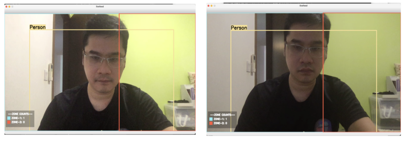
So we decided to house the legend in its own container with an opaque or translucent background. This ensures the content within the legend is legible.
We also used coloured icons to indicate the zones, instead of using text colour as an indicator. This greatly improved the readability of the text in the legend, and the visibility of the entire element.
